Typography

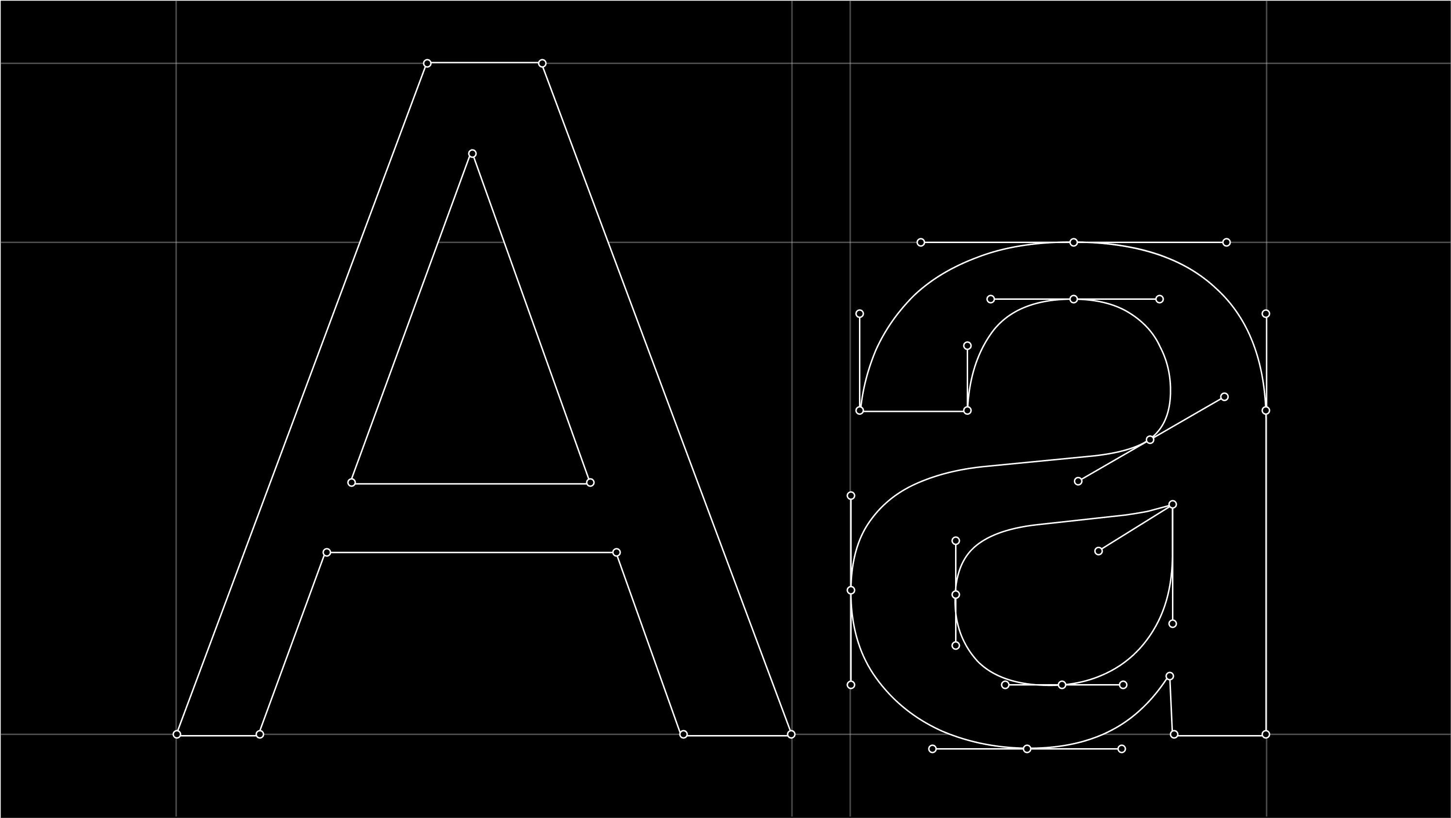
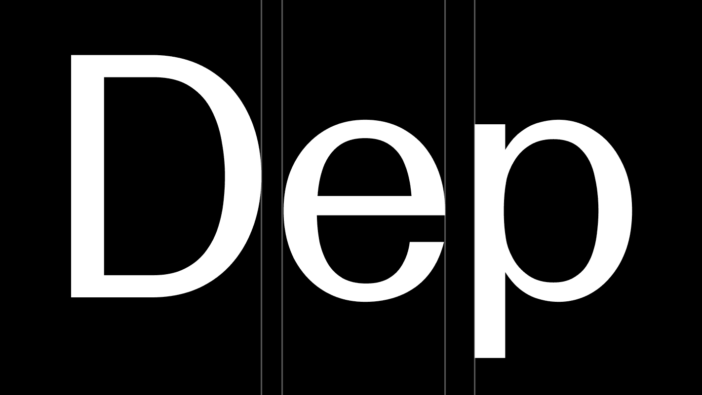
Our typographic approach is rooted in LL Geigy Duplex, our primary typeface. Drawn from the tradition of Swiss pharmaceutical design, it brings clarity, structure, and a sense of analytical rigor to how we communicate.
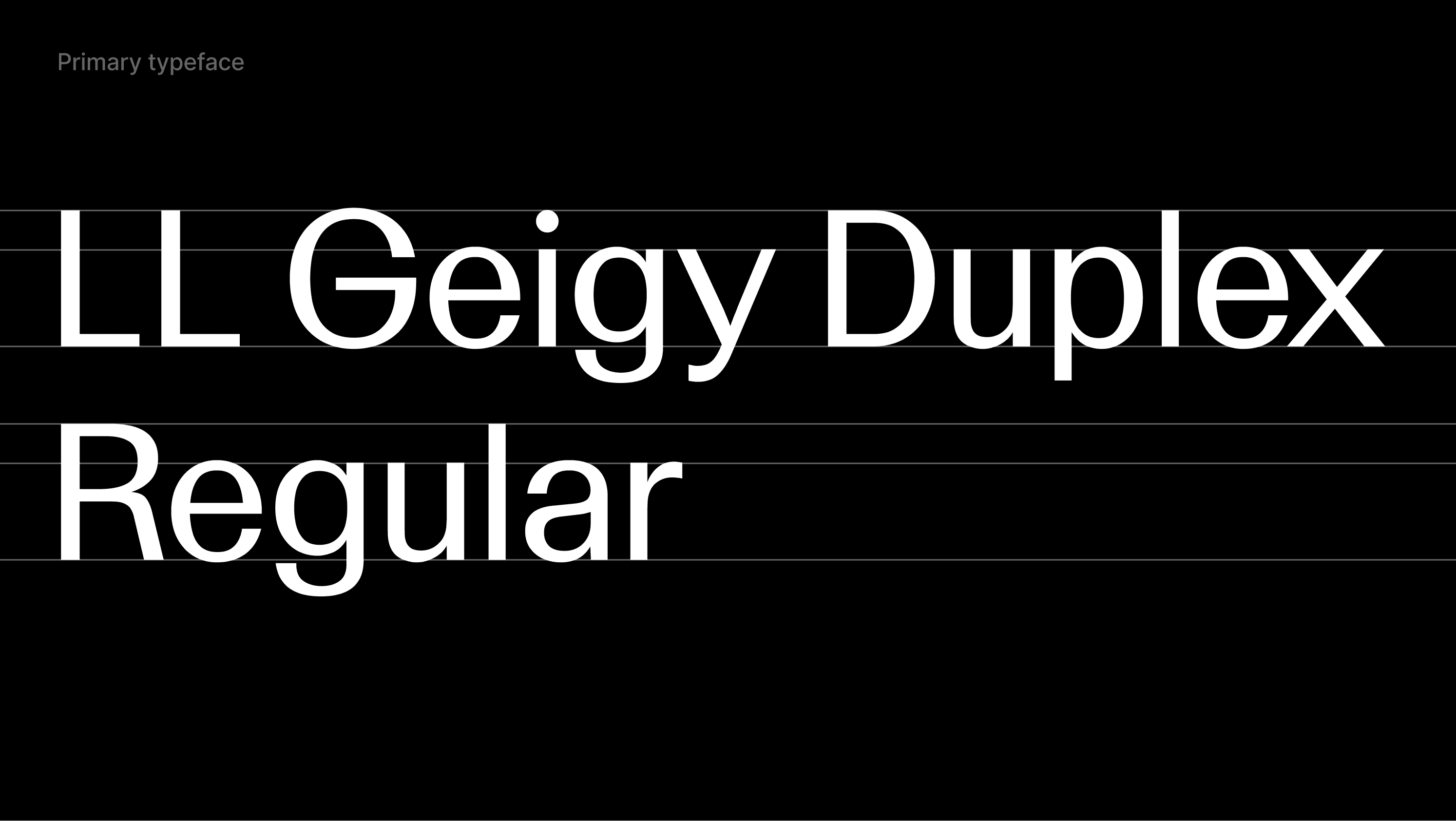
Primary typeface

Our primary typeface is LL Geigy Duplex by Lineto, used exclusively in its Regular weight. Its balanced proportions and distinctive, subtly dynamic curves give it a precise yet recognizable character, allowing it to perform consistently across all applications.

Secondary Typeface

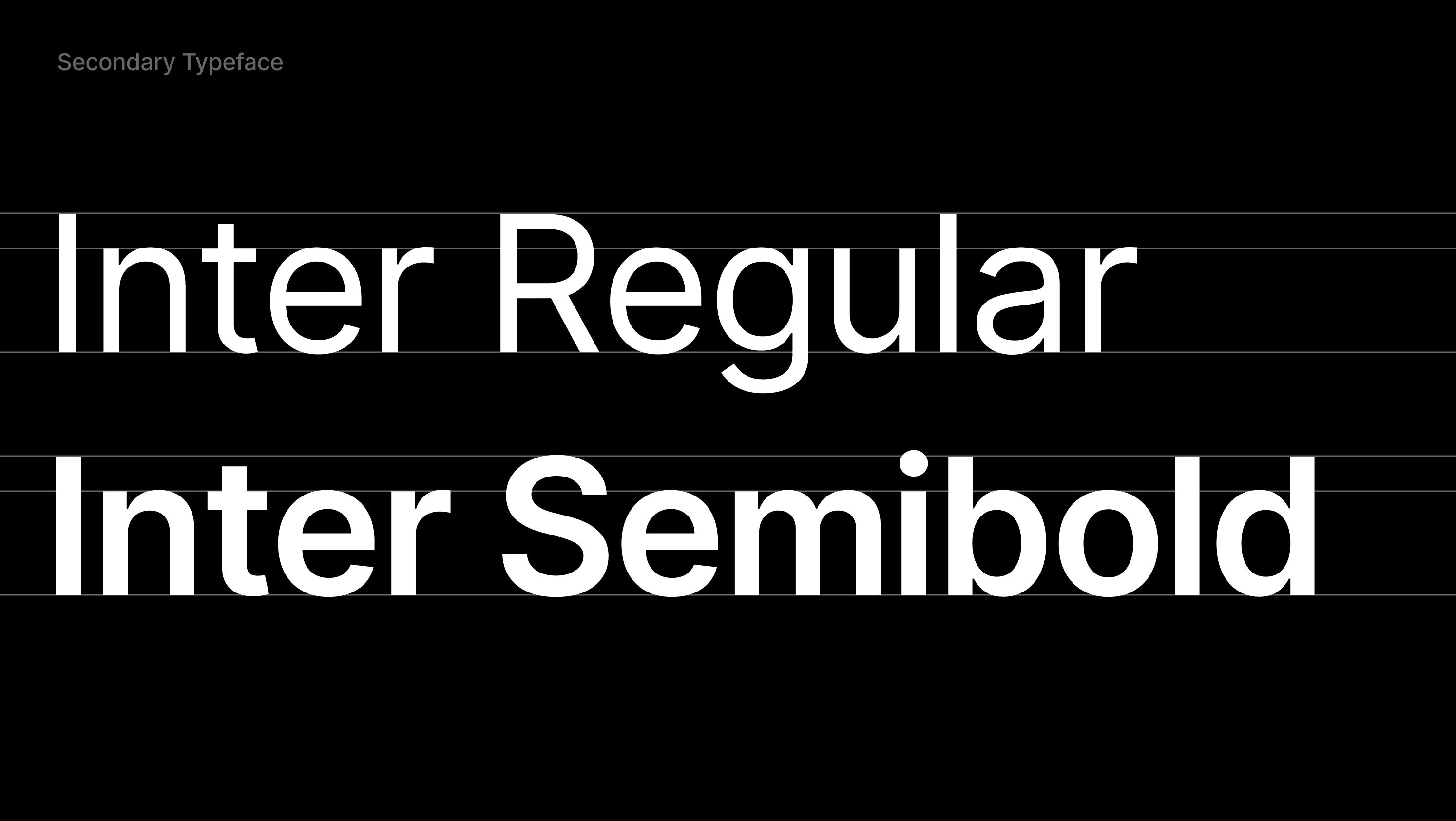
Inter is our secondary typeface and is sourced from Google Fonts. It is primarily used for body copy and captions, supporting clear and accessible communication.

In limited cases, it may also be used for small headings where additional clarity is required. Inter is also used in environments where LL Geigy Duplex is not available, such as the Google Suite. It is applied exclusively in Regular and Semibold weights.

Type hierarchy

Use the following examples as a reference when writing and designing content. They define how typographic hierarchy should be applied to ensure clarity, consistency, and readability.
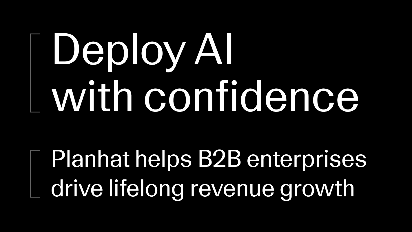
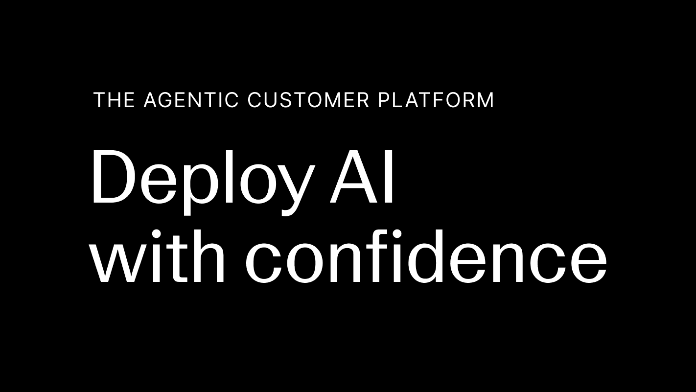
Eyebrow
Inter
Leading: 150%
Tracking: 50 (5%)

The Agentic Customer Platform
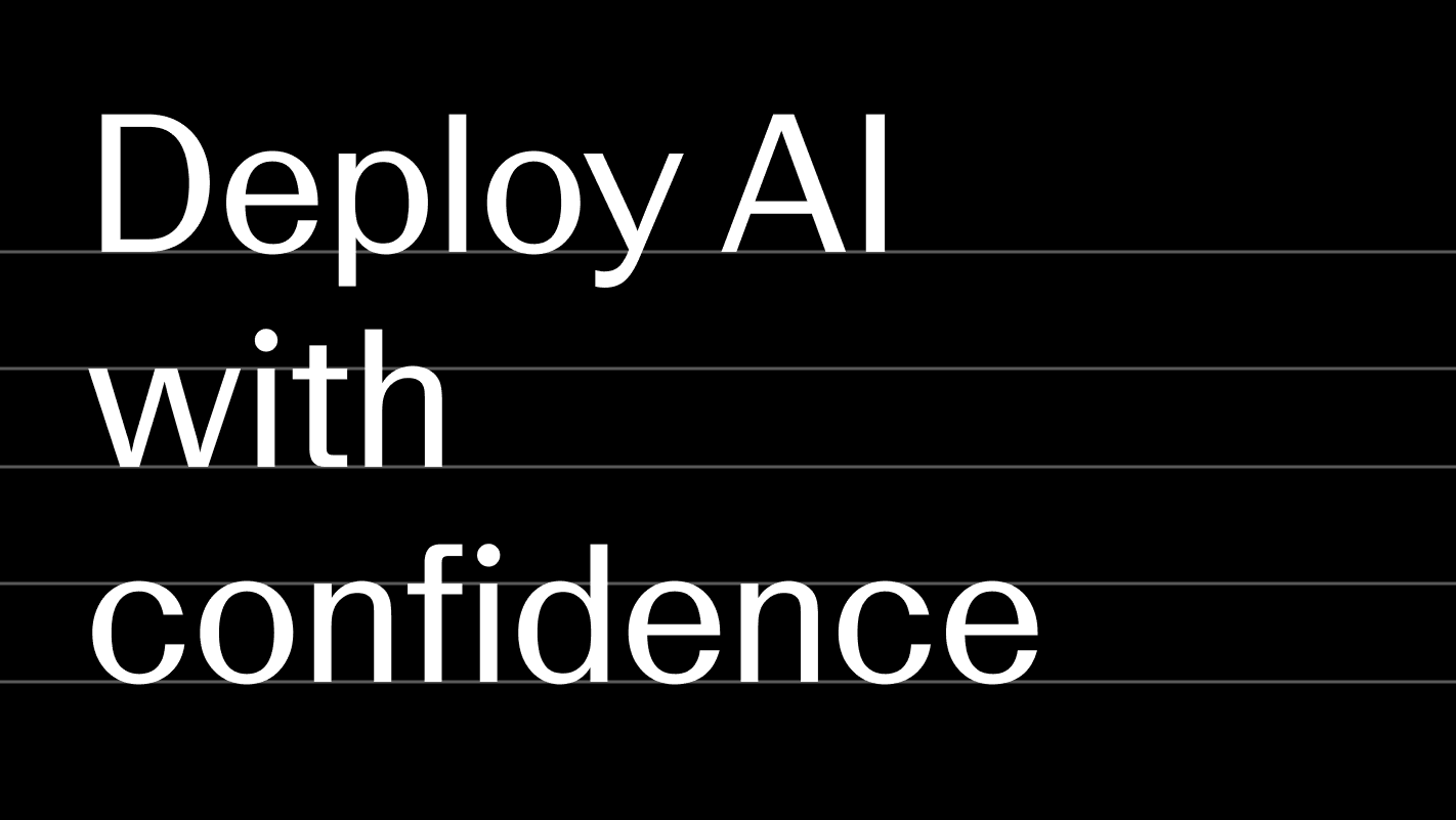
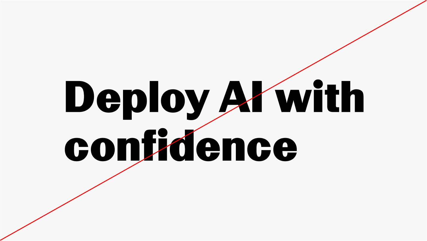
Headline
LL Geigy Duplex Regular
Leading: 110–115%*
Tracking: -30 (-3%)

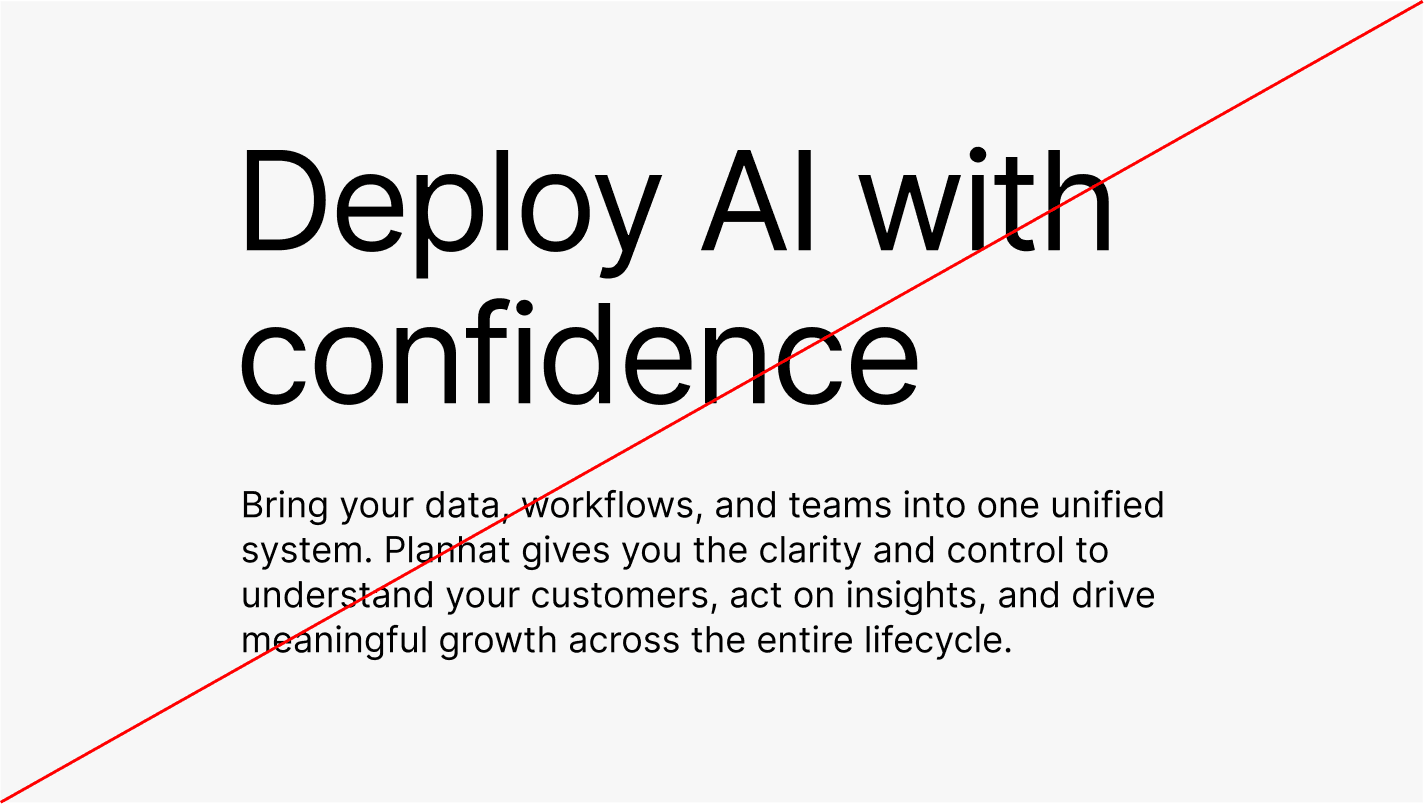
Deploy AI with confidence

Subtitle / Paragraph heading
LL Geigy Duplex Regular
Leading: 110–115%*
Tracking: -30 (-3%)

Discover what's possible with AI
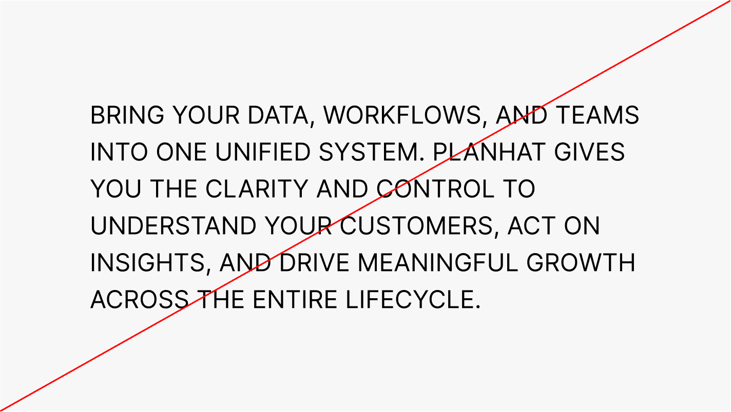
Body
Inter
Leading: 125–130%*
Tracking: 0 (0%)

Bring your data, workflows, and teams into one unified system. Planhat gives you the clarity and control to understand your customers, act on insights, and drive meaningful growth across the entire lifecycle.

Caption
Inter
Leading: 130%
Tracking: 0 (0%)

Real-world commercial outcomes delivered at unprecedented speeds.

* Leading can be adjusted depending on font size

Typesetting

Good typesetting requires a careful and considered approach. The principles below provide a foundation for setting type with clarity, consistency, and high legibility, and serve as a guide for how typography should be applied across our communication.
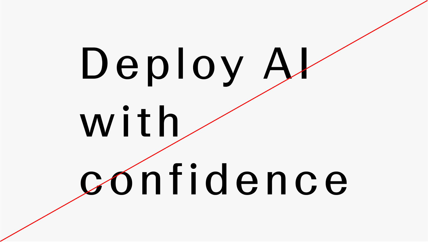
Leading

Leading, or line height, defines the vertical space between lines of text. It should be adjusted relative to the type size to ensure clarity and readability. Within our guidelines, leading typically ranges between 110% and 130% of the type size. Larger headlines use tighter leading, while body text requires more generous spacing.

Letter spacing

Letter spacing defines the spacing between characters in a line of text. It should generally be set between -3% and 0% (–30 to 0 in Adobe software) to maintain a controlled appearance. At smaller sizes, letter spacing may be increased beyond 0% to improve legibility.

Hierarchy

Hierarchy defines the relationship between type sizes and how information is structured within a composition. Strong contrast between sizes should be used to clearly differentiate levels of importance. Greater contrast results in a clearer and more effective hierarchy.

Case

Case defines the use of uppercase and lowercase letterforms in text. Sentence case should be used across all applications, as it supports clarity, readability, and a more natural reading flow. Uppercase may be used sparingly for emphasis or functional purposes, but should not be used for extended text.

Incorrect usage

Our typographic system allows for flexibility, but it should always be applied with consistency and care. The following guidelines highlight common misuses to avoid.

Do not use Inter for headlines

Inter is not used for headlines, except in environments where LL Geigy Duplex is not available, such as Google Slides.

Do not use uppercase for body copy

Body copy must not be set in uppercase.

Do not use unsupported font weights

Only the weights defined in these guidelines must be used. Avoid introducing additional weights, as this breaks consistency across the typographic system.

Do not alter leading or letter spacing

Leading and letter spacing must follow the values defined in these guidelines. Avoid arbitrary adjustments, as they disrupt consistency and visual balance.

Repository

Inter

Inter Regular

Inter Semibold

LL Geigy Duplex is a licensed typeface and is not freely available. For access or usage inquiries, please get in touch with Studio Planhat via marketing@planhat.com